Ergonomics Fail
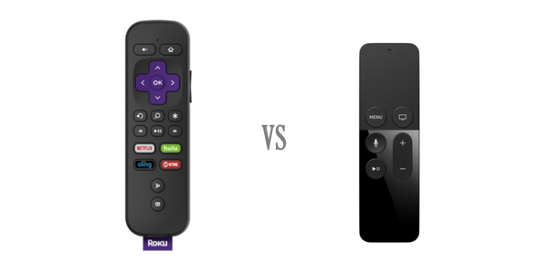
Not at all ergonomically friendly. Way too small for an adult hand. Compare it with Roku remote — a decent size remote which you can easily hold and work with. Roku remote is extremely well designed to fit an actual human’s hand.

Needless to say, we do not need Apple TV remote to be as busy as Logitech Harmony remote but sometimes over-simplifying does not work either.

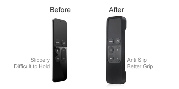
Case is a Must
Apple is obsessed with making products thinner and lighter. Apple TV remote is super thin and that is why, unusable. Apple’s minimalist instruction should suggest you to put a fat case before you can properly hold it and use. Making thinner iPhones might work for marketing purposes but a remote must have a good grip.

Frustrating to Use in the Dark
No backlighting on the Apple TV remote, maybe they want you to use iPhone’s flashlight more often.
Up or Down
You can’t (easily) tell which way is up just by holding it, you need to cheat and quickly look at the remote to make sure.
Let Users Feel It
Make the selections (AKA buttons) easily distinguishable by touch, let users use the remote by feel alone.
Touch Surface Tracking
By default Touch Surface Tracking is lightning fast and out of control, you can however make Touch Surface Tracking to Slow by going to the settings but the point is — we really don’t need the touch pad, that looks to be a forced functionality. Give us keys/buttons instead.
Oh! Mute!
Lower the volume all the way down, is that the idea? Where is the mute button? Why to ignore essential functionality just to reduce the number of elements on the remote.
Look Under the Couch
Find My iPhone app should also support the Apple TV remote. You lose it way too many times (you know, how tiny it is). It might be a good idea for Apple to give a Tile (stuff finding product) free with the purchase of Apple TV remote.
Thinner + Lighter
Who is really asking for overly simplified TV remote? Not sure why Apple is forcing themselves to come up with a design which accomplishes nothing other than making it different than everything else we have in the market.
Dear Apple, in the next release, please sharpen the edges a bit so that we can cut the apples with it.
- 10 UX Glossary Of Terms You Should Know
- 20 SEO Glossary Of Terms You Should Know By Now!
- 5 Best Beer Packaging Designs
- A Beginner’s Guide to the UX Audit
- All Websites Are Created Equal
- Apple TV Remote: Ridiculously Symmetrical and Highly Unusable
- Best Practices for Constructive Design Feedback
- Boost Your Conversion Rates with these 15 Website Design Best Practices
- Design Principles for Web
- Error Messages Design: Best Practices
- Five Absolutely Fantastic Cosmetic Packaging Designs
- Form Without Labels: Don’t Use The Placeholder Text!
- Is UI Designer same as UX Designer?
