1. Use consistent branding across the site
Marketers often fail to understand how branding works. More specifically, they are not aware of how web branding affects conversions.
Apple is a company that mastered the fine art of branding. It’s not just about the distinctive Apple logo; every part of Apple’s website conveys its brand values: sleek design, useful tools, and elegance.
In a recent article, the marketing agency Marion distills a beautiful brand: “Developing a brand is storytelling. Is your website telling the right story, or are you unwittingly strengthening the wrong feelings about your company? Before you embark on a web design project, decide what story you want to tell.
Base it on the values , beliefs, and target audience of your brand.
2. Leave a lot of white space between the elements White space
Also called negative space — gives room for website elements to “breathe” visually.
If you group items too close together, you risk overwhelming visitors and convince them to click away. You can see extreme examples of cluttered web design across the Internet.
Some mistakes, however, prove far more subtle.
When designing your website, use margins and padding to increase the space between images, copy, and other elements.
3. Reduce the number of choices you offer to your visitors
Hick’s Law states that, as you increase the number of options that you offer to someone, decision time increases as well.
It is often referred to as “paralysis analysis.” UX expert Paul Boag says, “When faced with overwhelming choices, the most effective way to encourage users to make decisions is to suggest a course of action.” That’s why we put so much emphasis on CTAs during conversion rate optimization (CRO).
Instead of presenting 20 products to your visitors on the homepage, just suggest one.
You’ve seen that Apple is following that approach in the screenshot above, even though it makes a lot more products than the iPhone.
4. Apply the rule of thirds
The rule of thirds has long been applied to fine art and photography, but it also applies to web design.
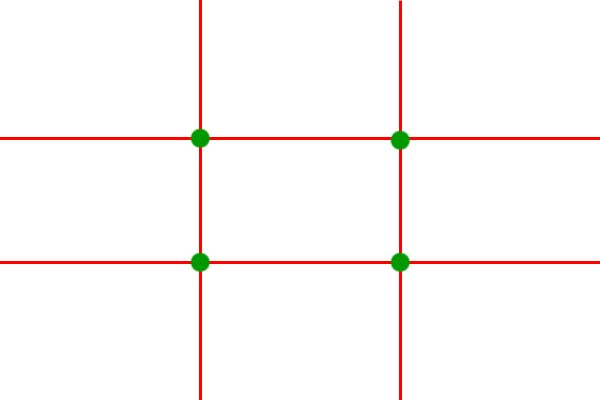
When designing your site, use an overlay with two horizontal lines and two vertical lines that are evenly spaced out. Green dots are points where the eye naturally drifts when looking at a scene, whether it’s a landscape photograph or a web page.
5. Compress images as much as you can
According to MachMetrics, a site speed monitoring service, the ideal site load time is only 3 seconds.
However, based on industry averages, most websites are loaded much slower than that. Unfortunately, attention span does not allow long load times.
If you want to boost conversions, you need to find ways to reduce page load times so that your page speed improves. Image compression is one of the best methods I’ve ever found.
Not only should you upload images that are no larger than the size of your screen, but you should also compress them after uploading. There are several WordPress plugins for this purpose, including Smush.
It’s a lightweight, handy tool to make your pages load faster, especially if you’re using a lot of images. Knowing this, you can put your CTAs and other important elements on the dots.
Just make sure that the rest of your web design flows naturally around those elements. This compositional approach may work for any type of website.
6. Add breadcrumbs
Think of your website as a map with lots of different destinations.
Your visitors can land at any destination on the basis of how they arrived, but they also want to know where they are. Breadcrumbs are like those signs in the mall that say, “You ‘re here.” They tell you where your current page is in the site’s navigation.
Breadcrumbs are becoming even more important on e-commerce websites.
If you have dozens or even hundreds of nested categories, you don’t want to lose your visitors. If they can’t find what they want, they ‘re going to look for it elsewhere.
7. Use color and contrast to your advantage
Contrast helps certain features of the website to stand out from the rest.
If you want your users to convert to an offer, make sure that you use more contrast in those specific areas. For example, if you visit Neil Patel Digital, the home page uses contrast through my signature bright orange to make people look where I want them to.
The aim is for visitors to click on one of the two orange CTAs.
There is also a link to “RETURN TO SITE,” but it is rendered in a much lower contrast. This subtle trick can help to boost conversions.
8. Animate the top bars and pop-ups
Use with caution! This one’s tricky, so I want to be clear: animated top bars and pop-ups can either help or hinder your conversions.
However, if your animation annoys your visitors, they will click away without bothering to look around your site.
You’ve got to be subtle. Done correctly, however, small animations can draw attention to your CTAs and boost conversions.
9. Logically group elements
When we view a scene, such as a website, we automatically group similar objects into our minds. According to the Interaction Design Foundation, “similarity can be achieved by using basic elements such as shapes, colors and sizes.”
Try experimenting with color, shape , and size on your most important pages to create associations.
10. Incorporate the human face
Writing for Thrive Global, veteran web designer Marc Mazure says, “The human face generates emotional reactions, triggers an individual to feel something, be it empathy, happiness, excitement, and the like.”
11. Use familiarity to your advantage
Consumers are bound to expect certain things when they arrive on the website.
For example, if they’re shopping for a product and visiting an e-commerce store, they ‘re ready to look for the “Add to Cart” or “Buy Now” CTA. We ‘re programmed to read human faces, whether we see someone in person or view a photo on the website.
Expressions can influence how we feel about something like that. You can use people’s photographs to tell people where to look.
If, for example, you have a photo of someone looking at your headline or CTA, your website visitors will also feel compelled to look at it.
12. Learn to restrict number of options
I mentioned above that you don’t want to give too many options to your prospects.
However, you can boost conversion rates by using alternative website design best practices that capitalize on a desire to get something free or discounted. If you present your prospect with the path of least resistance, your conversion rate may rise.
13. See how visitors navigate your website
Have you ever wanted to look through the shoulders of your website visitors to see exactly how they interact with your site?
I’m not going to recommend breaking and entering, but there’s another way. You can optimize each page for conversions.
Designing your website based on how real people use the site can make a huge improvement in generating leads and sales.
14. Create separate landing pages for SEO and paid ads
Best practices for website design vary depending on how you use a specific page.
I recently wrote an article on my personal blog about the marketing mistakes that I’ve made over the years. Specifically, I pointed out the importance of targeting your landing pages for an organic search or paid ad — not both.
I compared the two landing pages of the insurance company, one of which I found through search ads, and the other through organic search.
The first one is very simple and simple.
It’s designed to move people through a converting funnel. You don’t need to implement SEO if you pay for Google ads or social ads.
People will see your page based on how you’re going to click. However, if you want to rank well, you need long-form content — as in the second example above.
Using more words will help Google figure out what you’re saying and how users can benefit from it.
15. Remove the slider and the carousels
At one time, the website design of best practices celebrated the use of sliders and carousels.
Now, however, they are considered to be a source of friction. Web design expert Tim Sash of SiteTuners, in an article for Clickz.com, says pretty well, “Rotating banners are absolutely evil and should be removed immediately.”
According to Sash, all carousels and sliders are bloat your web pages, waste your visitors’ time, and push down the navigation and other relevant content.
If you use rotating banners, consider eliminating them to boost conversions.
- 10 UX Glossary Of Terms You Should Know
- 20 SEO Glossary Of Terms You Should Know By Now!
- 5 Best Beer Packaging Designs
- A Beginner’s Guide to the UX Audit
- All Websites Are Created Equal
- Apple TV Remote: Ridiculously Symmetrical and Highly Unusable
- Best Practices for Constructive Design Feedback
- Boost Your Conversion Rates with these 15 Website Design Best Practices
- Design Principles for Web
- Error Messages Design: Best Practices
- Five Absolutely Fantastic Cosmetic Packaging Designs
- Form Without Labels: Don’t Use The Placeholder Text!
- Is UI Designer same as UX Designer?