Keep in mind, there could be million other designers researching inspirations at the same time — getting equally inspired by similar trends and eventually producing similar designs irrespective of their business goals, requirements or the site content.
Design trends exist for a reason — they could have worked perfectly for a specific site with specific requirement. Others see it, quickly get inspired and apply the same on their designs (needed or not) — trend continues and it doesn’t take long for all other designers to jump on the bandwagon.
You must have a valid reason to follow a design trend. Every detail or design decision should have a purpose — enough said!
Here are some overused, and often abused design trends we must avoid:
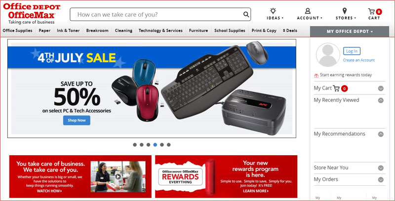
1. Awfully Large Image Carousels
Carousels seem to be everywhere, they are big, bold and you can’t simply miss them! They essentially look and behave like a banner ad. Users ignore them, you should too!
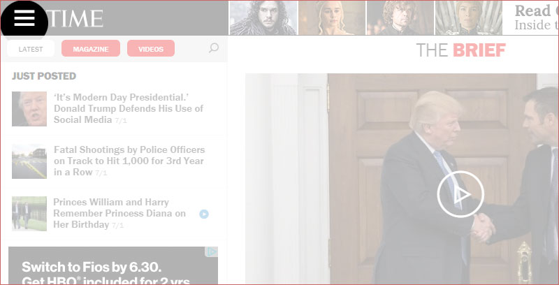
2. Hamburger Menu
Please don’t hide your essential menu content under a hamburger. The functionality is easily available and implementable, but let’s not get too excited and make it a must have for all the sites out there.
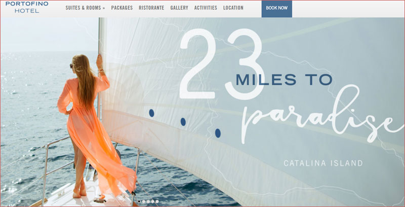
3. Supersized Hero Images (and Large Full screen Backgrounds)
They look good, but they are highly ineffective and a waste of critical real estate. You can define them as large attractive headers too. If you are able to support it with relevant content and call to action buttons – great, otherwise they stay as a unnecessary decorative design element. Hero images are still a great option for personal websites but think twice before using them for company sites with a lot of content and offerings. Often times, they push important body text down below.
4. Parallax Scrolling
If you have a story to tell and you are good at it, definitely use Parallax — otherwise skip it! Parallax allows the foreground and background content to scroll at different speeds, a very cool feature packaged with mediocre user experience. Parallax is not anymore new or interesting, this concept has been overused and overdone already.
5. Video Background
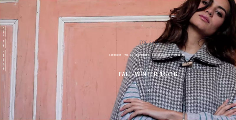
Still relatively new concept but it is catching up real fast (soon to be everywhere and boring). Again, the rule of thumb: don’t just use because you can. Video content should reflect your site’s business goal or message. In most of the cases, it is only a distraction and bad user experience. If you have a website focusing on selling a product and service, video can help putting your message across (only if done correctly). Regardless, if you decide to do video, keep it mute, keep it light-weight and keep all the different devices in mind.
Please don’t feel compelled to include one or more of these trends into your designs. Some sites feature these trends as “must have” — ignore them if you can! Keep the site fresh, that is important but don’t always fall for what’s new and trending. Focus on your website’s business goals and most importantly, test the site, get user feedback, and have it periodically reviewed.
- 10 UX Glossary Of Terms You Should Know
- 20 SEO Glossary Of Terms You Should Know By Now!
- 5 Best Beer Packaging Designs
- A Beginner’s Guide to the UX Audit
- All Websites Are Created Equal
- Apple TV Remote: Ridiculously Symmetrical and Highly Unusable
- Best Practices for Constructive Design Feedback
- Boost Your Conversion Rates with these 15 Website Design Best Practices
- Design Principles for Web
- Error Messages Design: Best Practices
- Five Absolutely Fantastic Cosmetic Packaging Designs
- Form Without Labels: Don’t Use The Placeholder Text!
- Is UI Designer same as UX Designer?