Good news is, you can use placeholder text with any HTML input type. On the other hand, while a lot of designers and developers in the field of UX were (over)excited by the idea of having the placeholders – that didn’t necessarily mean that it helped end users in anyway.
Here are the reasons why the idea of placeholder text went viral:
- It helps shorten the length of a form.
- It reduces clutter and the visual noise on the screen.
- You can use placeholder text with any HTML input type.
- It works with most of the modern web browsers and the smartphones we currently have.
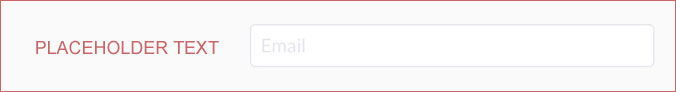
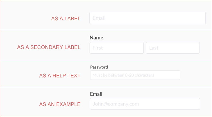
- You can use placeholder text as a primary label, secondary label, help text or an example for the field.
It essentially is a great way for the designers to show-off. Eliminating labels and help text on a screen makes it cleaner but is it usable?
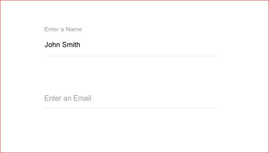
At first glance, a form full of placeholder texts can look cleaner. But the moment you start filling out the form, you realize the importance of actual permanent labels and help text. Labels would disappear as soon as you start typing. At some point, just to be sure, if you want to see a label again – you must delete the text you just typed.
It in fact is a burden on short-term memory. Before you start typing, you have to make sure you read and fully understand the label text – because it is going to disappear soon.
A few more reasons to (seriously) avoid the placeholder text:
Try reviewing what you just did:
After filling the form, before clicking Continue or Submit, you might want to do a quick form review. Without labels, reviewing is a daunting task. It is also possible that your favorite web browser that auto-completes form fields for you, may have filled in information incorrectly. Without labels, there is no way you can quickly validate.
In case of errors:
This is challenging! There will not be any labels or instructions visible outside the form fields, you will have to go back to each field to reveal the description in order to fix the error.
And many more:
- What if your browser from 19th century does not support placeholder text (highly unlikely but possible) – you would only see blank fields with no labels. Impossible to proceed.
- When implemented incorrectly, you will have to manually remove the placeholder text using backspace in order to type your content.
- It certainly is bad for accessibility. Keep in mind, the default light gray color of placeholders has poor color contrast against most backgrounds. For a lot of users, light gray makes it difficult to read the text. Also, not all screen readers read placeholders aloud.
Why Not Floating Input Placeholders:
Floating input placeholder text is an enhanced version of the original placeholders. Another design trend people fell for. Similar to its original version, this creates more usability issues than fixing it.
- You do not save any vertical space by using floating input placeholders. Why not simply place labels at one spot rather than making it jump around.
- The overall animation is not very user friendly. It is distracting and disorientating.
- Inconsistent experience for the users and this is another reason why it is not recommended. Floating Input Placeholders work with text boxes, however, radio buttons, check-boxes and select boxes use the standard/static labels.
- Overall, you do not gain anything by using floating placeholders, you just distract users. A cool feature which does not seem to work.
Alright, anything we can use:
If you really-really want, try placeholders (original or floating) on a login screen with 2-3 fields (Email ID and Password). However, If Email ID is interchangeable with User ID, usability of the form will increase if a regular input label is used instead. If you need to get only credit card number and expiration dates, placeholders can be used (with great caution).
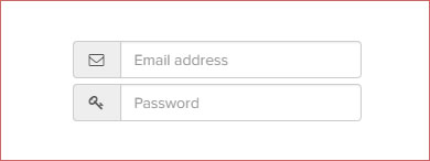
Here is an example from Fontawesome.io, where instead of labels they use icons. Placeholder text is secondary. Icons would always give users a clue about what to enter or what they should have entered. This, however, is not possible with longer forms as you may not find appropriate icons for all your fields (and it would not look appealing).
A big victory for static/conventional labels!
As a functionality, placeholders are great! However, it only creates usability issues (there could be exceptions, but not worth trying). Try to use the conventional label and field combinations. Let the users see all the labels all the time. Tighten the spacing if needed, try reducing the font size if that helps but don’t play the game of magically appearing/disappearing or moving labels.
We must keep inventing and apply new ideas to our designs, placeholders are NOT one of them!
- 10 UX Glossary Of Terms You Should Know
- 20 SEO Glossary Of Terms You Should Know By Now!
- 5 Best Beer Packaging Designs
- A Beginner’s Guide to the UX Audit
- All Websites Are Created Equal
- Apple TV Remote: Ridiculously Symmetrical and Highly Unusable
- Best Practices for Constructive Design Feedback
- Boost Your Conversion Rates with these 15 Website Design Best Practices
- Design Principles for Web
- Error Messages Design: Best Practices
- Five Absolutely Fantastic Cosmetic Packaging Designs
- Form Without Labels: Don’t Use The Placeholder Text!
- Is UI Designer same as UX Designer?