Error Messages Design: Best Practices
Error messages should be simple and direct, preferably actionable, written in an easy-to – read language and quick to understand.
- Avoid obscure codes and abbreviations like “the success of the received response is false.”
- Provide succinct, straightforward explanations of the issue, rather than “an error has been made.”
- Stop accusing people or asking them to do something wrong — saying it was a “illegal command” for example.
- Provide constructive error messages in context, so that people can solve the problem.
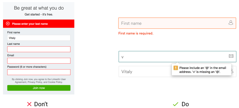
- Avoid only turning the field red to signify an mistake. It’s not making it accessible to disabled people. Having other visual signs which the colorblind can see is often best.
- For input fields on the forms, use inline validation.
- Error notices do not go away until people fix the problem.
Get Expert Design Feedback: Improve UX!
Other Design Articles
We have hand-picked a few highly recommended articles for anyone with an interest in User Experience and Usability. Let's read:
- 10 UX Glossary Of Terms You Should Know
- 20 SEO Glossary Of Terms You Should Know By Now!
- 5 Best Beer Packaging Designs
- A Beginner’s Guide to the UX Audit
- All Websites Are Created Equal
- Apple TV Remote: Ridiculously Symmetrical and Highly Unusable
- Best Practices for Constructive Design Feedback
- Boost Your Conversion Rates with these 15 Website Design Best Practices
- Design Principles for Web
- Error Messages Design: Best Practices
- Five Absolutely Fantastic Cosmetic Packaging Designs
- Form Without Labels: Don’t Use The Placeholder Text!
- Is UI Designer same as UX Designer?