When you really want to stand out on the shelves, elaborate and colorful cosmetics packaging is just the trick to try. The global cosmetic industry is full of bright and attractive packaging designs. It is indeed hard to pick just five.
We bring to you the top five hand-picked examples of the most creative beauty packaging designs.
5. Topshop Make Up
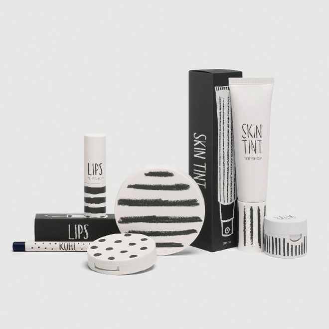
This British-based store may not be on top of your list of cosmetics brands, but the packaging definitely makes it worth looking at. There is a quaint hand drawn quality to the simple packaging design.
The minimalist design, created by Sarah Thorne makes use of Matt finish details, take its cue from Topshop’s trademark design aesthetics. Where we feel packaging lacks is its slightly childish stripes and dots pattern.
4. Dior J’Adore Eau de Parfum
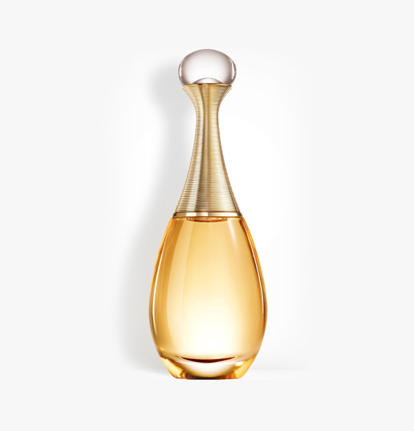
This is what we like to call an iconic cosmetics packaging. The slender, elegant and classy bottle immediately stands out everywhere. The Dior Packaging Department definitely knows how to make a statement.
The simple and classic design elements, incorporating aspects of contemporary design styles, makes this packaging design a lesson for cosmetics designers everywhere.
3. Les Merveilleuses De Ladurée (Face Color Rose Ladurée Mini)
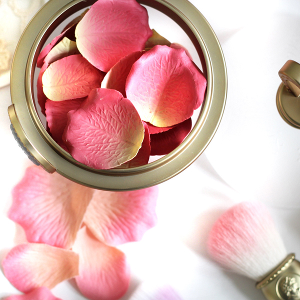
When you package a blush to look like a delicate little rose, you know you have hit cosmetics packaging jackpot. The Face Color Rose Ladurée Mini is something of a cosmetics packaging genius indeed.
However, stunning packaging idea aside, the design does have its limitations in the user experience department. The delicate petals most definitely requires some getting used to. You can’t really call it the most user-friendly packaging.
2. Smith & Cult Nail Lacquer
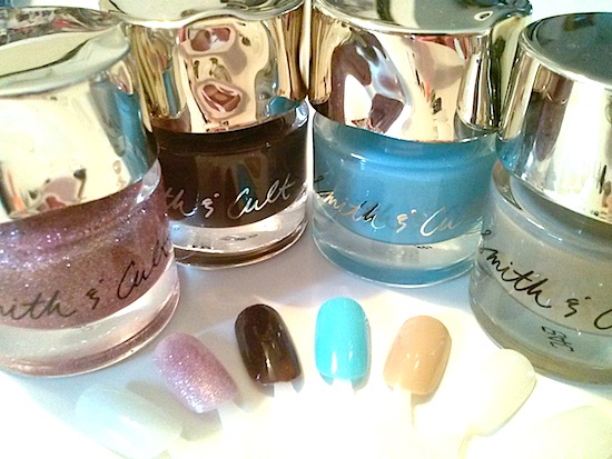
The hammered metal handle and chunky bottles come with the coolest looking nail paint shades ever. The edgy and attractive cosmetics packaging designs are the brainchild of Dineh Mohajer, who rocked the cosmetics industry with her iconic brand Hard Candy.
An extra point goes to Smith & Cult for their absolutely fantastic and imaginative names. After all, getting clever with product names is all part of a great user experience!
1. Tory Burch Catch Eye Shadow Palette
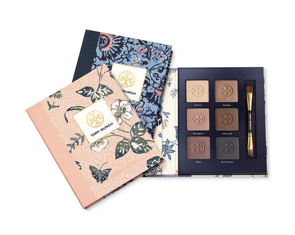
The reason this beauty product tops the list as the most attractive cosmetics packaging design, is because of the illusion it creates. At first glance the palette might look like an everyday journal, it is when you lift the beautiful floral printed cover that you encounter the most luxurious shades of eye-shadow.
Unlike the tremendous delicacy of the Face Color Rose Ladurée Mini, the use experience of the classic palette design of this product is much better. It incorporates the best of visual stimulation with simplicity of use, making it worth the premium position in this list.
Beauty of packaging designs
We all agree that we shop with all our senses. That is what all of the above beauty products packaging designs have been incorporated. This is exactly what makes these cosmetics packaging designs stand out from the rest.
- 10 UX Glossary Of Terms You Should Know
- 20 SEO Glossary Of Terms You Should Know By Now!
- 5 Best Beer Packaging Designs
- A Beginner’s Guide to the UX Audit
- All Websites Are Created Equal
- Apple TV Remote: Ridiculously Symmetrical and Highly Unusable
- Best Practices for Constructive Design Feedback
- Boost Your Conversion Rates with these 15 Website Design Best Practices
- Design Principles for Web
- Error Messages Design: Best Practices
- Five Absolutely Fantastic Cosmetic Packaging Designs
- Form Without Labels: Don’t Use The Placeholder Text!
- Is UI Designer same as UX Designer?
